Thursday, January 29, 2026

[ART] Anchoress Alley

 Anchoress Alley

Resources used:

  • Palette: my own, several palettes used during graphic conversion to my own palette (Rosy 256, Rosydream, Doom Arcadia, Chasm: The Rift palette)
  • Colormap: my own
  • Sprites: my own
  • Textures: Doom 2, my own, textures made by Rencoret, COMTEX, Juggernaut (Quake 2 addon) textures, Biolage texture pack, Realistic Texture Pack, Anon Old Stuff archive (Truespace 4, NuGraf textures), Texture Town, Poly Haven, Zekhmet resources, System Vices, Firerainbow 2; further details on textures can be found in the CREDITS lump in the resource wad included in download
  • Source port; format: Eternity, MBF21 (should run on any MBF21 port)

Wad file:

DOWNLOAD [resource pack - "Has Minna trully become sussy" map file - "Minna has indeed"]

Description: 

2026 has been quite an interesting year for me so far, with both bitter downs and beautiful ups already behind me. I'm happy to say that as of writing, I'm doing quite well! There's a lot of difficult things behind me, but also a lot of beautiful moments, as well as personal and spiritual growth. Artistic growth too! Starting in mid-December I began toying with the idea of making my own palette from scratch. I wanted to make a palette that was distinctly my own, yet also carried a bit of the unusual energy that the palettes used in Quake and Quake 2 have. Early this month, I settled on the palette I used here! Besides the Quake games, another source of inspiration is a Yume Nikki fangame - Collective Unconscious. That's where silly names for the map and resource wad come from - the protagonist of Collective Unconscious is called Minnatsuki. 

Once I had finalized my palette, I began to slowly make and compile various resources for it. This definitely took a while, but the effort was well worth it! As it stands I now have a fully fledged resource pack for my own palette, with almost every texture and flat from Doom 2 having been replaced by custom ones. While it's quite usable as is, I don't consider it finalized, and definitely plan on expanding it further. 
The central idea behind this painting were anchorites. I wanted to include them in a painting in some way, with inspiration behind that coming from reading about Julian of Norwich and her writings. She was an anchoress, and her experiences and writings brought me a great amount of comfort and guidance during a difficult time recently. The ideas I had for this painting were rather vague, so a lot of the fine details were realized during production. For example, having the anchorites bellow the pavement was an idea I got after I had taken the initial canvas screenshot in Eternity. The holes they're in aren't in the map itself, I drew them onto the scene in Aseprite.

The cyclops holding a pair of dolls is inspired by one of my partner's OCs, who is featured in Shade, one of my older paintings bearing their name. The single eye is a feature of some of my partner's other OCs, which I also drew before [Fun at the Fair, Evening Playtime]. I drew them last and I was a bit tired by that point, so instead of trying to draw a realistic body I drew something more abstract and playful. 

All in all I really enjoyed making this, and I'm happy to be finally posting new art again! While making this, I listed to music by a band I'm really fond of, called Van Der Graaf Generator. I definitely recommend listening to their music, with some of my own recommendations being: Lost, House With No Door, Emperor In His War-room and Refugees.

Special thanks to Rencoret for making the custom sky I used here, it did a lot for the atmosphere of this painting!

Tuesday, January 20, 2026

[ART] Dump of my older art 9

 Life After Quake


Resources used: Lost Civilization, Meye.dk, Texture Ninja, BurningWell.org [sky photo by Titus Tscharntke], TextureTown (I keep misremembering it as TextureHouse for some reason), En Campaña, COMTEX, Quake 2 textures from Realm667, Bauhaus, A.L.T.

Wad file: DOWNLOAD  

Decided to make a combo out of the palettes from Doom and Quake, and that gave me inspiration to make some art. The palette proved to be quite to my liking; the original Quake 2 palette doesn't mesh well with the lighter tones of Doom graphics. Beyond the color palette, Ayba, Cacodemon187 and Saige also hooked me up with some cool sources for textures and sprites, and that gave me even more inspiration. Eventually made this. The idea of a berserker from Quake 2 settling down was a natural result of all the ideas floating around and the fact that I was using Quake 2 colors and textures. 
The berserker here became enraptured by the peacful countryside he found himself in, and chose a more peaceful life. Since the Strogg never gave him a name, he chose the name Valentin Mészáros Velho Mazzaferro.  

-8. September 2025.

Quake 2 was a bit of an awkward game for me. When I first played it as a teenager in highschool, there were things that definitely appealed to me, mainly the guns, though the railgun was a bit disappointing to me as it couldn't compare in looks to the Gauss rifle from Fallout 3 and New Vegas, which is similarly functioning weapon. Note however, that while both a railgun and a Gauss rifle use electromagnetic forces to propel projectiles, they're not the same thing; railguns achieve propulsion using a pair of conductive rails connected to the projectile, while Gauss rifles, or coilguns, use an array of coils surrounding the barrel. From this description you can hopefully tell that I really liked the Gauss rifle from Fallout :P

Besides the guns, the rest of Quake 2 always left me wanting, mainly because I was really into its predecessor's weirdness. Quake 2 has since grown on me, and I've come to appreciate it a lot more. As far as this painting is concerned, it's quite nice! I feel like paintings for which I crack open Lost Civilization's vast collection of tree sprites and midtextures are ones which I always enjoy.

 Davno Veče


Resources used: Heretic palette and colormap
Wad file: DOWNLOAD  

Yesterday I played a Yume Nikki fangame called Quilt and I became delighted by it instantly. So much so that I wanted to make something inspired by its various vistas. This piece is a result of that. Decided to use the Heretic palette this time, and like with my Hexen palette painting I chose to make all the textures by hand. Didn't make sprites, instead I chose to draw in the additional details in Aseprite.  

-13. September 2025. 

Can't have a painting with the Hexen palette without also making one with the Heretic palette! However, making this proved to be a bit of an eye-straining experience after a while, those blues and oranges sure are something. Was pretty cool drawing in background details, it feels like something that was a big thing in my older work but gradually became less prevalent. Also love those little waves I drew in the lake - w -

Name means "An Evening Long Ago" 

Пустош


Resources used: En Campaña by @Rencoret [contains stuff from Hexen, Extremal Doom, Deliverance, and some resources made by Rencoret personally], a custom palette I made by overlaying the Quake palette over the Doom palette in Aseprite

Wad file: DOWNLOAD  

I was talking about palettes with Plerb and she got curious what would happen if the Quake palette was overlaid on top of the Doom palette, so I did just that and found the result quite interesting. I forgot which layer setting I used in Aseprite to get this exact effect, I do know I set the Quake palette to 50% opacity or something. First thing I tested the palette on was Rencoret's En Campaña, and I really liked the look. 

I wanted to make a painting with it and eventually I gave it a shot. I wasn't really feeling inspired so eventually I gave up on it. Yesterday I remembered it and took a screenshot of what I had made and showed it to my friends, who found it really interesting as is and thus I decided to simply upload it to this thread. 

-25. September 2025. (Map made on 16. August)

 Title means "Wasteland"

When I first showed it to her, Ayba noted how the barren and sparse look of this shot contrasts with my other paintings, which is certainly an interesting point and I think the main reason I decided to upload this. It was also handy since I hadn't uploaded a painting since the 13th. 

I'll take this opportunity to shout out Rencoret's En Campaña - it's one of my favorite maps of his and I highly recommend it, alongside the rest of his wads! 

Buggernaut


Resources used: textures from Juggernaut (unofficial expansion pack for Quake 2), sky texture derived from photo by Iván Cisneros, custom palette I made by combining colors from Doom and Quake 2, various tree sprites and a midtexture I drew myself

Wad file: DOWNLOAD 

Been a while since I made a Doom painting! Пустош has been sitting on my hard drive for a while so not counting that. Been quite occupied with playing System Shock and Quake 2 stuff :P
I decided to finally sit down and play through Juggernaut, an old addon for Quake 2 made by Canopy games. Main reason I decided to play it is that I used some of its textures for Awaiting Eschaton and during the time I worked on it I formed a particular emotional bond with those textures. So I felt like I owed it to the folks who made the textures to play it. I marathoned about 95% of it yesterday and it definitely felt like a marathon. It definitely has an interesting vibe and it's definitely a charming little thingy. But it also has gameplay that I very much didn't enjoy, and the maps were often really crude. Ah the wonders of shovelware!

Despite my grievances with its gameplay, I'm most glad I played it, thought I can't recommend it in good conscience unless you're really into weird and janky stuff from the 90s.

Anyways, been slowly making stuff for this painting since I made Davno veče. First things I made were the tree sprites and midtexture, which I'm really happy with. Quake 2's colors work incredibly well for outdoorsy stuff like trees. Can't say I had a concrete vision for this painting, I just doodled around pretty much. I think once I found Iván Cisneros' photo and edited it into a sky texture my creative juices began flowing. Was thinking of adding more detail or characters to the foreground but I enjoyed the scene on its own quite enough, and didn't see further additions as necessary, though I did feel compelled to add that subtle arrow pattern in the water. Fun fact: the water is actually just the unedited BLOOD flat from Doom. It got turned blue due to the palette I used.

-28. September 2025. 

Wasn't a good idea to treat Juggernaut as a chore, it certainly soured my first playthrough, though there was other stuff going on in my life at the time which didn't have me in the best state of mind. In any case, I cannot understate how much Juggernaut's textures mean to me. I've enjoyed them ever since I made Awaiting Eschaton.

An important milestone happened here: I began making my own tree sprites! I've mainly used my own tree sprites since, and I love them all! If you wish to use some for your own projects, I wholeheartedly welcome you! Just mention me in the credits and you're good! 

Sumrak


Wad file: DOWNLOAD

Resources used:

Various sprites and textures I made, some being edits of stuff taken from the bellow resources.

NuGraf textures, taken from this archive. I used the statue sprite from the "BOHUS" folder inside the "NuGraf textures" folder within the archive.
Biolage texture pack (I made the streetlight sprite from one of the textures in this pack, as well as the textures named BIOEDTxx).

3DS Max textures, also found on the linked archive above. That's where the sky is from.

Marlin Studios textures, from the same archive. MRSTD01 is from the rustic exteriors pack, while MRSTD02 is from the downtown surfaces and signs pack.

TextureTown.

Fence texture made by Rencoret. I made an additional variant of it that's yellow.
COMTEX texture pack. Made some edits to a couple of the textures from there: an older texture called CMTXED01 and two textures named COMLITxx (variants of textures included here that were tinted yellow).

Juggernaut textures. Made some yellow tint edits.

Quake 2 textures. Tinted one one of the textures yellow. 

Description:

Happy to say that I've gotten warmed up for making my paintings again! Had a creative lull during the latter half of September than ended with my previous painting, and now I'm back at full steam! Quake 2 is a gift that keeps on giving - this time around I got inspired by its colored lighting and wanted to pull something like that off in Doom. The way I went about this was making edits of the textures that were close to the streetlights. I simply applied a yellow multiply filter over them, as well as drawing some simple reflections in the windows. I think the effect is wonderful and I certainly want to use it more in the future. I'd say overall my use of lighting had gotten less interesting imo, and I'm really glad I went all in on it here.

Another thing I'm quite happy about is the way I made the scene itself. I got inspired by Ayba's recently released Belot and as a result I played around with more abstract structures and with having a more distant view, rather than having all the stuff happening close to the camera. Other stuff of note includes some tree sprites I made which were sitting around as unused scraps which I got to use here. The red-blue trees were pure red in the Doom palette but my palette was applied on top of it while it was still in the Doom palette and it created the canopy colors you see here. The trunk looked busted but it was fairly simple to just remap the colors to something that looked more natural.
 

It's funny how I can't get enough of the Quake 2 derived palette I made and of the textures from Juggernaut. There's something about this palette that just draws me to it. It's mostly made out of Quake 2 colors, and Quake 2's colors have become beautiful to me. They appear to be on a very similar wavelength to Doom's colors, but realized in a way I prefer. They feel more grounded, but still vibrant enough to not appear out of place in Doom. The mashup palette I made is also delightful because while it allows me more freedom with certain colors, it's still limited in some aspects, which feels like a creative puzzle in a way. Doom's palette feels familiar to me, but now I have a palette that's it's own thing, and feels like something I'm still exploring.

I think I've become an actual Quake 2 fan. Been playing Zaero, another unofficial expansion and having a real good time with it. Hell I decided to replay Juggernaut again while on a Discord call with some good friends of mine and I genuinely enjoyed that too. I think my first playthrough of Juggy sucked because I was having a bad day while playing it and my expectations for it were too high, which led to disappointment. Now that I know what to expect from it, I can enjoy it more for what it is, and find stuff I genuinely like about it besides just the textures and artstyle. For example, while the levels are very much undercooked, they do have some really pretty places in them regardless. And the way colored lighting is used sometimes is really pretty. Juggernaut overall feels like a more vibrant world than Quake 2, which is I think why I fell in love with its textures during the development of Awaiting Eschaton, and I think it helped me appreciate Quake 2 more as well. I owe it a lot, I really do. 


As you've probably noticed already, I reorganized the stuff that's under my paintings. Main reason for this was because I knew I'd need to put the resource list under a spoiler, since I wanted to really go out on the attribution. I always appreciate it when mappers credit the stuff they used in a cohesive way that lets me know where they got each thing from, so I wanted to offer more information on that front. While there's something I love about finding the source of a texture, or at least tracing it as far back as I possibly can, it's quite a time consuming and tricky thing to do, so I obviously can't say that I can offer the original source for every texture I use, but I will try to give the earliest one I can reasonably find. For example, TextureTown hosts free to use textures, but I fairly sure most if not all are 3rd party, royalty free textures from the 90s. However, since TextureTown doesn't say where each is from I can't really trace them back any further.

PS: I'm gonna host my paintings on Doomworld from now on, in light of Imgur getting blocked in the UK and also the fact that I uploaded a bunch of them while not logged in so they might expire. The paintings are quite small: this one is 51.4 kB, so Doomworld's space limit won't be too much of an issue for them. I plan on moving all of my previous paintings to Doomworld as well, though I don't feel like doing that immediately :P

-4. October 2025.

 I forgot how long that description is jeez! This definitely feels like one of my most "serious" paintings. No silly guys, no doodling, and lots of thought and time put into all of it. Certainly proud of it, though it doesn't undermine my love for the rest of my art one bit.

 I plan on moving all of my previous paintings to Doomworld as well, though I don't feel like doing that immediately :P

Yeah, I sure didn't feel like doing that immediately - I still haven't done it! Forgive me Britain! At least now I got them all on postimages as a result of moving them to this blog, so I'll probably get all of them replaced one of these days.

Title means "Twilight". 

Evening Playtime


Wad file: DOWNLOAD 

Resources used: 

Quake palette, Quaddicted wad collection[jf_obtex - textures by John "Metlslime" Fitzgibbons; qedsamp - not sure where they're from, might be this], COMTEX, Da Werecat's textures, various textures and sprites I made. There's a bunch of old textures I made for the Quake palette quite a while before I made this painting, I decided to include them in the wad file for posterity. 

Description:

I tried my hand at making one big collection of textures that I could use to house multiple painting maps but alas it appears my immune system has a tendency to reject any semblance on professionalism :P
I was also rolling with a custom palette that was a mashup of Doom and Quake colors, but after I saw that a Quake palette texture I really like didn't convert to it nicely at all, I scrapped it, and that was also when I got sick of the one wad multiple paintings idea too. Things were just getting too big for my enjoyment, I feel like trying to add so many textures bogged me down. In the end the usual way of doing this is just more fun - I don't end up tied to any one part of the process for too long. And one advantage of this setup is that every wad is fully tied to its one painting - it's fully part of its story. This one for example has a bunch of unused textures that to me feel like imprints of the creative process that led me to the final result. 

Anyways, I love this painting! The Quake palette has shown itself to be quite nice to work with and I like the kinds of vibes I can pull off with it. I feel like Quake as a series is predominantly rather gritty and edgy, which is cool but I really like exploring other feelings with its components. The icing on the cake is definitely Loria - the little girl some might recognize from Fun at the Fair. I really like how she turned out!

-14. October 2025.

Words cannot describe how much I love this one! I'm so happy with how I was able to depict Loria, and I'm always proud of how I managed to make the water look translucent with some midtex trickery. I was certainly more able to make use of Quake's palette then I was when I made Shade. I made a bunch of new tree sprites for it, found new and interesting ways of converting textures to it through Aseprite (the circle pattern texture by the pond is from Comtex, and is a Doom palette texture in its original form). 


Closing Thoughts 

And with this, everything I had on the 97th Century Exhibition topic on Doomworld is now on my blog! I have to admit, one of the reasons for starting this blog was a general bitterness I had towards Doomworld at the time, but that has thankfully mellowed out as I chose forgiveness and healing over holding grudges. Another thing I admit that this certainly felt like a chore at times! Nonetheless, I'm really glad to have done this. It was a wonderful opportunity to reflect on my journey as an artist and person, and to share some details I overlooked at the time or that only revealed themselves in retrospect.

I hope you've enjoyed this retrospective journey with me, and I hope you join me wherever my art might take us next! 

Have a great day and God bless!


(ノ◕ヮ◕)ノ*:・゚✧


[ART] Dump of my older art 8

 YouTube Jorts


Resources used: Texture Town, a picture I took, my other paintings, Atari 2600 PAL palette

Wad file: N/A

I was browsing Pinterest and looking at cool art, which got my creative juices flowing. All of a sudden I got the idea for the above painting! It just kinda popped into my mind lol. Was originally gonna feature my persona here, but I settled on this silly little alien. Way I drew it was inspired by the styles of certain Yume 2kki developers, mainly Luok and Colby. Finished this quite quickly too lol, very quick painting! I also decided to use the Atari 2600 PAL palette for this, which is one of the Aseprite presets.

The pictures are, from left to right: a Texture Town picture, Finitude Engine, a portion of a photo I took, My nodebuilder has lead me to places that I wouldn't even go to with a gun, untitled and unfinished painting. Finitude Engine and My nodebuilder has lead me to places that I wouldn't even go to with a gun can be found in dedicated posts here in this thread, while the full unfinished painting can be found in the description for my painting titled Prange. 

-23. July 2025.

 Quite playful and experimental this one! Stands out from the rest of my gallery, similar to how "Worship" does. Atari 2600 PAL did "My nodebuilder..." rather dirty :P

Haven't given the little green guy a name. Uhhhh... Krrrrpč!

Night Life

Resources used: Half Life, ALT, Killing Time, Mortiser texture pack, Hacx, Sunlust and Magnolia palettes

Wad file: DOWNLOAD 

Played through Miasma with Ayba's new reskin - Artifika. While playing, I noticed that the entire Mydolyn reskin doesn't really use the blue and bright green ranges in the Doom palette so that gave me inspiration to tinker with them more radically. I did and ended up with the palette I used here. I imported the reds from Sunlust and the tiny blue range from Magnolia, and then replaced the remaining blues and the bright pink range with various shades of purple. Quite like what I pulled off with it - having a functional range of purples while the greens remain untouched is really useful. 

I still wasn't sure what I'd make with it thought. That was until I decided to play some Half Life 1 deathmatch, which was a ton of fun, and found myself inspired to tinker with Half Life's textures. Some of the Xen textures translate pretty well into my new palette, and soon I had several textures ready and made this!

Quite happy with this piece, I enjoy the juxtaposition of the alien looking terrain and the more terrestrial vegetation. 

-25. July 2025

I still love how Killing Time's trees look! I also enjoy the central scene unfolding here, with the sphere from Hacx and the entity emerging from the mysterious blue liquid. I feel like I could have played with the juxtaposition of Half Life's Xen textures and the trees in more interesting ways, but the painting is just fine as is nonetheless.

Picycle ride 

Resources used: Synami Speedmapping Sessions

Wad file: DOWNLOAD [needs to be loaded with the Synami Speedmapping Sessions resource wad] 

Synami has been popping off lately and her development as an artist is really cool to see. I found the palette and resources from her new community project really neat, but I haven't been in the mood for making regular maps lately, let alone speedmaps. So instead, I decided to contribute to the project my way - with a painting! 

For this one I drew inspiration from a bicycle ride I had through my home village yesterday, and overall it has a similar feeling as Riverside, my second ever Doom-painting. So naturally, I decided to bring back the two characters I made for Riverside! I imagine this is set in the same village as Riverside is, just a different spot.

Haven't given these dudes names so here goes:

White outlines person: Žuvajević Pavao
Crescent shaped thing: Sir Gudizzzn (courtesy of Cacodemon187) 


Overall I had a lovely time making this, even experienced a sense of healing through the process of making the painting. 

-28. July 2025 

 As I read the original description again, I was instantly brought back to that aforementioned bike ride. It was a beautiful one, and I still remember the scenery I took in that day. 

Eventually I ended up making an actual map for SSS01 anyways, it can be found in the MAP30 slot, titled "Find my poop fountain" (real fucking classy there lmao). 

ZTA Nice City


Resources used: Bauhaus, Nuetex, Epic 2, Synami Speedmapping Sessions, Baphomet's Satelite

Wad file: DOWNLOAD 

D2IRO recently saw the light of day and with it the map I made for it. @ivymagnapinna found it cool and mentioned how for someone who prefers to make these Doom paintings, I'm able to make a map she quite enjoyed. That got me thinking about potentially making a new wad of some sort. I eventually decided that I'm still a bit burned out and uninspired for such a thing, however I did come up with a neat idea while I was brainstorming. That idea became the painting you see here!

Yesterday I was playing Collective Unconscious with my partner and we visited a location in the game that had a color palette I quite enjoyed, and I realized that I've already have a palette like that - it's the one I made for Krš. Today I came up with the idea for the mini-skyscrapers in the forested hills, and afterwards started working on adjusting the palette a bit and also compiling resources. During that process I decided to make this a painting rather than a regular wad. I'm glad I did, I feel like the idea works better this way.

One thing making this reminded me of is how much I adore working with Bauhaus' assets! I feel like that wad has become a mainstay of my resource pool.

-30. July 2025.

An advantage of doing these art dumps is that I get to read the descriptions of all my paintings, which allows me to refresh my memory and revisit aspects of the past I've kept outside of active memory. I haven't thought much about the story of "ZTA Nice City" since I made it and if someone had asked me to tell them about it from memory I might've had trouble. When I posted this to Bluesky, Indigo posted the Talk Talk song "[Nothing But] Flowers" in the replies, which I hadn't heard before and that I've since enjoyed quite a bit! I associate the song with this painting because of that.

Anyways, at long last, this is the last painting I made in July '25! I counted 10 paintings made in July, which is pretty nuts.

Shade


Resources used: Happy Time Circus 2 (for map wad file); Zekhmet project, Bauhaus, Doom 1, Form vs. Content, lostres, Quake 1 palette and textures, Lost Civilization, Biolage textures, Crista Forest's textures, a couple of personal edits of Bilage and Crista Forest textures (for resource pack wad);

Wad files: Map (needs to be loaded with the texture pack); Texture pack 

I've dipped my toes in working with color palettes completely different from Doom's with Awaiting Eschaton, and this is my second go at such a thing. This time I've chosen to work with the palette from Quake 1, and I like it quite a lot! I mainly enjoy the less saturated look of the colors. 

I've compiled a large resource pack with graphics I've converted to the palette, and I intent to keep it updated as time goes on. Feel free to use the resource pack, simply credit me and all the aforementioned sources I got the textures from. Most textures have been renamed to signify where they're taken from. Although it might be a good idea to wait a bit until I refine the pack some more.


The character featured here is one of my partner's OCs, and one I'm quite fond of, since they reflect an aspect of my gender I feel. The background is inspired by an older picture of the front yard of my mother's old house, which has since been demolished. This was in a way an opportunity for me to channel those memories, since that place is one I have many fond feelings for. 

-22. August 2025. 

Awaiting Eschaton and Shade ushered in a new chapter in the story of my art. I've almost exclusively used palettes distinct from Doom's palette since. There was a freedom I felt in that, in being completely unbound by the constraints of Doom's color palette, and instead having the opportunity to navigate and get to know other palettes. The palettes for Quake and Quake 2 have by far been my favorites to work with, and they're both dear to me. There's something about them, perhaps the fact they were made during the transition into full 3D graphics and hardware rendering, that gives them a look and structure that feels quite distinct from Doom and its contemporaries.

I love this painting, I love it a lot. I love my partner and his OCs, and I love the village and memories that inspired the scenery here.

PS: Forgot to write this when I was initially writing this blog post but it's no longer a good idea to wait for me to refine the above mentioned texture pack; I abandoned it a long time ago lmao. Feel free to make use of it with credit!

A Quiet Night


Resources used: Hexen palette

Wad file: DOWNLOAD  

I decided to play both the Heretic and Hexen remasters recently and they're both wonderful. I only played a tiny bit of Heretic before and never touched Hexen, so I'm really happy to finally be playing them for the first time!

One of the many things I enjoyed about both games is how they use color - so much so that I decided to make a painting using Hexen's color palette and colormap. I also wanted to make all the textures and sprites myself. I went for a handrawn style over photo-manipulation or editing existing textures, and I'm quite pleased with the result. I feel a comfy, yet mysterious vibe with this one.

 -4. September 2025

 Only painting I made with Hexen's palette so far. It was an interesting experiment, and I like how it looks. Don't plan on making more stuff with the Hexen palette, mainly because keeping graphics specifically made for certain palettes organized can get a bit tedious, so right now I prefer focusing on palettes I really like and want to invest time in, which have so far been Quake and Quake 2's. 

Monday, January 19, 2026

[ART] Dump of my older art 7

 Daydream


Resources used: Texture Town

Wad file: N/A 

I was made aware of Texture Town by @stephyesterday a while back and I instantly fell in love with the site! So many cool textures! I was converting some to the Doom palette, but noticed some that looked really cool but didn't seem usable in game, so I decided to take two and make art with them. One of my favorite arts I've made. The girl here is in a way an embodiment of myself and my gender - an appearance I yearn to embody. 

-21. July 2025. (painting made on 23. June)

Note: All art in this blog post was made during my Doomworld account suspension and uploaded to the forums in bulk on the 21st. 

This piece is still a banger, I love it! The blue lady here has definitely become my persona, and you'll be seeing more of her very soon. As for my gender, I'm dreaming of looking like a member of a psychedelic rock band from the 60s, with the vibrant paisley shirts and stuff.

 Lijep i Sunčan Dan


Resources used: ALT, DaWerecat, Epic2, Hacx, Texture House, Banjo Kazooie textures compiled by raddicted

Wad file: DOWNLOAD  

Loved my new persona so much I had to draw here again! This time I made use of the other texture town textures I've compiled, plus some others. Quite happy with the palette I made for this, the blue and lime/brown ranges mesh quite nicely! 

-ditto (painting made on 24. June)

 Told you you'd be seeing my persona very soon! Didn't believe me did ya? Heart too blinded by pride and Eggman YTPs innit? Better get your peanuses out of my thousand cereals!!!

 Anyways, really went ham with the Texture Town textures here. This turned into a really vibrant and bright piece, which is rather funny to think about considering I was quite mad about my account suspension at the time. In the end nothing's ever cut and dry, amid all the bitterness I had for Doomworld beautiful things were happening also. 

BTW I'm listening to an Orange Lounge music compilation while writing this and it fits the above two images and the one bellow really well! Also, title means "Nice and Sunny Day"

 Mačja Posla

Resources used: Texture Town, Rosy256
Wad file: N/A 

Since I had made a persona for myself, I decided to make a persona for my partner as well! This was a prototype of his design, though it hasn't changed too significantly yet. 

-ditto (painting made on 25. June)

 This is the last painting I did before my 8 day stay in Montenegro. I think the lead-up to that kept my spirits high, and contributed to the more vibrant look of the above 3 paintings. Way I drew my partner's persona is still very cute, though my partner is also very cute, so can't say I'm surprised teehee ^ ^

Title means "Cat Business"

Conferencia Internacional 

Resources used: Texture Town
Wad file: N/A 

Early this month I came back from an 8 day vacation spent in Montenegro. The whole thing was quite a special event for me. Had many lovely moments, but some downsides also, one of which being that I couldn't make art or hang out with my close friends as much. So when I came back home I soon drew this to celebrate my friendship with my closest buddies! @Ayba - top left; my partner MittenBits - top right; me - bottom left; @Cacodemon187 - bottom right;

Used a pretty wacky palette I made quite a while ago for this, was pretty fun tinkering with it.

 -ditto (painting made on 8. July)

 Montenegro trip is a special memory for me, and I felt all kinds of things throughout its duration. Poured a lot of love into this piece. It's also the last piece in this four-part series of tropical vistas and good vibes. 

The title was inspired by one of Manu Chao's songs (Mentira...). I listened to Manu a lot at the time and I still enjoy his tunes. 

Leptirica


Resources used: ALT, Mek's Box 'o' Skies

Wad file: DOWNLOAD  

Was struggling with finding inspiration after making Conferencia International, and this was something I made during this period of creative lull. I was messing around with making my own tree sprites, and settled with these cartoony looking ones. There's a couple of others that went unused in the wad file. 

-ditto (painting made on 11. July)

 Things began looking a bit different. I was still really into that vague 60s vibe but the vibrancy of the previous paintings was gone. I guess with my vacation over negativity was more present in my life. I made this half a year ago so I cannot recall all details, so I do wonder how much the vibe of this painting and some of the ones I made after were connected with my mental state.

I find it funny how I was troubled by an art block and about not having ideas even though I made this a mere 3 days after I made Conferencia. While I was still super passionate about my work and put lots of love in it, this whole thing was kinda starting to look like a content mill in a certain sense. I was thinking a bit too much about engagement and keeping up a certain pace of production.

Title means "Moth". Never named this purple fella. Henceforth they'll be known as Zdenko.

My Buddy Đunž


Resources used: Baphomet's Satelite

Wad file: DOWNLOAD [needs to be run with Baphomet's Satelite by Cacodemon187]

Another piece from my lull period. Was thinking of Cacodemon187's Baphomet's Satelite and decided to make something with its resources. Tried to channel some of Monti's energy with this. 

-ditto (painting made on 13. July)

 "Lull period" they say as they made two paintings in the span of three days. Ohhh if only 97CF from last Summer could see me now! Haven't made a new painting since Christmas!! Doesn't mean I've been doing nothing, matter of fact I've been preparing my very own resource pack as of late! More on that in due time.

This painting is definitely rather gloomy, quite a shift in general vibes. Page 3 of my art's Doomworld topic was really vibrant and whimsical, and things definitely changed after Leptirica and this. They marked an end of an era for my art, and I feel that my art wasn't the same after this.

I know at the time I didn't really like this painting, but over time it grew on me. There's a certain feel to it that reminds me of Yume Nikki.

Загрљај Ноћи


Resources used: Ayba's textures and sprites

Wad file: DOWNLOAD

The thing that got me out of my creative lull was gender lol. I had a vision in my head of my persona in Ayba's Kyst, and it felt incredibly compelling to me. Working on this was a genuine joy, and seeing the scene slowly form was such a beautiful sight to me. I'll be forever grateful to Ayba for being such an amazing friend and for creating such a beautiful world. 

-ditto (painting made on 15. July)

 I still remember the joy I felt as I made this painting. It was definitely a precious process. There's a certain reverence I have towards Kyst and all the textures and sprites Ayba made for it. A reason why I haven't used them much in my paintings is because I'd feel weird using them in something that wasn't explicitly linked to Kyst.

Title means "Embrace of the Night" 

El Pájaro Pingas 


Resources used: NuevaMaratón.wad from Cacodemon187's Cacofiles

Wad file: DOWNLOAD [needs to be run with NuevaMaratón.wad from the Cacofiles] 

A gift for Cacodemon187. He had his birthday recently and I only found out at that day. So I frantically thought of something to do to commemorate it and settled on making this painting with the Nueva Maratón resoueces. Another one of my favorites. The person in the center is inspired by the Selk'nam people of southern Chile and Argentina, while the birds that surround them are inspired by the art of Violeta Parra. This and my previous piece reminded me of just how lovely Doom's vanilla palette can be.  

-ditto (painting made on 18. July)

 This and the previous painting are quite more positive, though not as brightly colored as my older work. A definite shift towards less saturated colors and a more quaint and gentle tone had occurred. I'm really glad I got to make this in time for Rencoret's birthday, it's a painting I still love. At the time of writing, this is the last painting I've made with Doom's stock color palette.

Title means "The Pingas Bird" 

Azure Neighborhood 


Resources used: Zekhmet project, NuevaMaratón.wad, Killing Time, Bauhaus

Wad file: DOWNLOAD  

Made this today in the morning! Yesterday I wasn't too inspired but I wanted to make art anyways so I improvised and cobbled together the aesthetic you see here. Definitely inspired by Cacodemon187's Conchazumanga. Quite happy with how this turned out!  

-ditto (painting made on 21. July)

 Another painting I didn't really like at first, but it grew on me over time. I decided to forgo a signature on this, and it's a decision that stuck. Funnily enough Rataratata, the artist I mentioned in my last old art dump, posted a painting with his signature around this time, which isn't something he usually did. Another fun coincidence is that the original Imgur link I used for this on Doomworld had the word "red" in it. I'll share it for posterity:

https://imgur.com/mredhxk 

Besides Conchazumanga, I was also inspired by a building I saw in a nearby city.

Thursday, January 15, 2026

[ART/WADS] Collection of development snapshots

 
 I've decided to share a collection of various mid-development screenshots and scraps of my works, mainly my paintings but some pictures of my wads also make an appearance.

There's lots of stuff and I'm not in the mood to go over it all. However, if something catches your eye, feel free to reach out and ask, I'd love to share any details I can about it!

Without further ado, you can download the collection here:

DOWNLOAM 


Monday, January 12, 2026

[ART] Dump of my old art 6

 Prange


Resources used: Sepia palette (used as a foundation for making the palette used for this painting), Rosy256 colormap, Bauhaus, Killing Time, Lost Civilization, Zekhmet project resources, Plerbtex, PyddTex [textures by ContrastSaturation, enigma101, thestupidmeddy, The Royal We, Spacehunyango]

Wad file: DOWNLOAD

I tried to make a new painting two days ago with the same palette I used for the previous one, but inspiration had run dry. Instead I decided to finish my playthrough of Petyan's Sepia, and as I did I got inspired again. I also remembered the cover of a single from 1972 by a very obscure French rock band called Quo Vadis [the single in question is La Baraka] which has this interesting yellow-red palette with some blue accents, and I decided to emulate it by modifying Sepia's palette. Rosy256's default colormap came in really handy as the colormap Slade was making wasn't usable.

Besides the palette, most of the aesthetic weight here is lifted by Bauhaus and Zekhmet resources, with some help from a few other sources. Bauhaus+Zekhmet is for sure one of my favorite texture combos.

The weird shapes in the foreground are vaguely inspired by the works of various artists I like, mainly folks who're active in the Yume Nikki fangame scene.

As a bonus, here's the unfinished painting I worked on before this one, and some snapshots of this painting's development: 


-18. May 2025.

 Prange was a continuation of something that started after I first played Sepia, which was an appreciation of and inspiration by vintage photography. I still have a love for old-timey photography and film, as evidenced by my recent painting, "Under a Shooting Star". If you'd like to look at some interesting photos or movies from the early years of the 20th century, check out the works of Sergey Prokudin-Gorsky [early color photography] and Georges Méliès [famous filmaker, made Trip to the Moon]

Images from the description are Imgur links, but that should not be cause for concern for my dear British audience: I plan on releasing a zip file containing not only these but many more in-dev snapshots of my works!

Miris Ljeta


Resources used: Cubes Deep [Zekhmet textures, Magnolia textures, Gothictx, COMTEX, Hardfest 2], Lost Civilization

Wad file: DOWNLOAD

 I got inspired by a really cool artist and decided to make this piece. Ideas I started out with were experimentation with the vanilla palette and a somewhat more tropical/Mediterranean vibe. I decided to make use of a previous wad's resources instead of always compiling stuff from scratch so I decided to use Cubes Deep's textures for the most part, with some additions from Jaska's Lost Civilization. 
I quite like what I did with this one, there's a certain joy in exploring the capabilities of the stock PLAYPAL. 

-21. May 2025. 

 Talisman by the French band AIR is playing as I look at this picture again, and I gotta say it's a great companion to it! Can't miss out on an opportunity to plug AIR either, I fucking love their music. 

I still really enjoy the art made by the person whose Bluesky profile I linked above - rataratata, also known as Fumin. His art is excellent and he has also made some brilliant contribution to the Yume Nikki fangame scene! He developed a game called Quilt alongside three other awesome artists, and he also contributed to Collective Unconscious, which is a fangame designed to be played online, though for the time being it isn't playable that way. Instead, there's an offline build available.

Elderflower Season


Resources used: Lost Civilization, Sepia, pyydtex [sky texture by gwain]

Wad file: DOWNLOAD [bonus; older version: DOWNLOAD]

Sepia is definitely one of my all time favorite wads. Yesterday I was inspired to read about old-time photography techniques because of it lol, which led me to learn about a technique called cyanotype, which inspired me to create this painting. I didn't aim to emulate the appearance of cyanotype photographs exactly, I simplt hue-shifted Sepia's palette until I got a color that looked close enough.

For the theme of the painting itself, I was inspired by the elder trees that are currently blooming around my neighborhood. When they bloom, we collect the elderflowers and use them to make cordial, which is a kind of homemade soft drink. I also wanted to explore a more old-timey setting, with some more abstract elements for contrast. 

-23. May 2025. 

 We made plenty of elderflower cordial last spring, which is wonderful as I love that drink, and the fact we can only make it during a fairly brief time window each spring makes it a special occasion. 

Onto the painting. I like that I used the same sky texture as I did in Riverside, the second Doom painting I made. It gives this painting an interesting connection with one of its ancestors so to say. It's this feeling of being connected with the past and with ancestors that perhaps contributed to my interest in vintage photography and film. I'm often reminded of the time I'd spend looking at old family photos as a kid whenever I talk about vintage photography.

Вечерњи састанак 


Resources used: COMTEX, OTEX, Biolage texture pack, Bauhaus, Mek's Box 'o Skies

Wad file: DOWNLOAD

Someday back in February 2024 I believe, I happened to remember an idea for a setting that I had back in 2022, which at that point I had only illustrated with a crudes MS Paint sketch:  


The idea had quite a bit more going on that the sketch implies. One key feature it doesn't show is that the black desert can have an irridescent appearance, and I imagined that cities made in it would be made out of black marble with bright, iridescent inlay.

Anyways, on that day that I had remembered this idea, I also happened to see iridescent clouds in the sky, which I took as a sign and decided to try and realize that idea at last - using Doom mapping.

That decision launched me into a journey of trial, error, and scrapping a lot of stuff (check out the FOXFILES for those), and eventually, after my partner had noted how hopelessly caught up I got in trying to make a perfect palette that I was going nowhere, I entered a creative crisis that led me to say "fuck it" and start making these paintings instead.

And now we return to the present. I remembered the palette I used for one of my previous paintings, Finitude Engine (which was another attempt at adapting this idea) and decided to give this thing another go. I moved pretty fast, compiling the resources without thinking too hard about them, mapped without thinking too hard about it and once I had the screenshot open in Aseprite, I knew that it was finally time to declare this idea realized!

It turned out in some ways quite different to how I had originally envisioned it, but I'm fine with that. I have changed as a person since 2022 and so have my tastes.

I'm incredibly happy to give this random idea a home, and to aslo take my paintings full circle in a way.

Anyways, the big red creature is called Žoao Švprć, and the green figure embracing him is called Milorad. They are engaging in what many know as yaoi. 

 -24 May 2025.

 The title translates to "Evening Rendezvous". The description is already quite in-depth, so I've got little to add. I did take a picture of the iridescent clouds that day, and the date was saved, which was the 2nd of February 2024, pic taken at 10:30 AM. What a blessed day!

Jazmi


Resources used: Eviternity 2 palette and colormap by Dragonfly and Ukiro, Zekhmet project, SKY1 (not seen in the final painting) from Vanilla1.wad from the Cacofiles - original photograph by Nathan Lee Allen

Wad file: DOWNLOAD

Been playing through Eviternity 2 these past few days and got really inspired by its colors, so I decided to make something with them. I didn't use its base palette however, but instead translated the blue range and loosely imitated the lime range by hue shifting Doom's stock green range. Also fleshed out the pinks a tiny bit. Used the colormap for correcting the blues and greens.
At first I had a rough idea of replicating the look of Chefchaouen, but I wasn't feeling the idea after a while, and was left with this: 

 After some thinking, I remembered a dream I had last night, which was also related to Eviternity 2. Namely, last night I started playing Anteres031's Temeraire, and wasn't able to complete it before bedtime. So instead, my dreams tried to complete it for me, and at one point the local changed from a snowy seaport to a weird void that looked kinda like the sky in the final painting.
I used that weird dream place as a starting point for the new idea which became this painting. I made the new sky to imitate the dream visuals and used the existing Zekhmet texture edits I had made. I doodled around in UDB for a while and when I was somewhat satisfied I went on to Aseprite and doodled there, and eventually ended up with the funky looking snake and weird shapes accompanying it.

 -28. May 2025.

 Something that struck me while compiling these is how crowded the second half of May was! All the paintings above were made in a timeframe of just 10 days! I found the fact that Elderflower Season and Вечерњи састанак were uploaded just a day apart by far the most remarkable. 

I've yet to actually finish Eviternity 2 in its entirety. I reached the final episode but then I felt tired of playing it so I moved onto other stuff. It definitely looked cool, maybe one day I'll feel in the mood to play through it. 

 Okay let's talk about this painting now. It's quite funky and interesting, and I like how one of the shapes surrounding the snake is party covered by it, creating a cat-like silhouette. The title is the Serbian word for snake, zmija, with its syllables swapped. That's a kind of argot common in my language, it's called Šatrovački. The overall visuals feel representative of a vibe that's present in a lot of my art from the first half of last year. Funky, colorful and flashy. I recall being filled with a burning enthusiasm at that time. I was living the dream in a way, several people loved my art, I loved my art and delighted in it, and it was all quite the high I must say. Perhaps this explains the rapid-fire releases of this period - I was in a rush, I wanted to make as much art and cool stuff as possible. I was riding the high. I was cruising down the highway in a shiny new car (funny analogy as I've never actually driven a car) and unbeknownst to me, a wall was waiting up ahead. But I hadn't reached it yet. From where I was, life was good, and for a few more paintings, it would be.

Feenstraße 


Resources used: Custom palette made by Plerb [combination of Rosy256 and DreamPal + a custom colormap made by me], car sprites by OceanMadman, zimp sprite by faegameboy, sky from Epic2, Bauhaus, KillingTime tree sprites, COMTEX, Mortiser resources, Lost Civilization

Wad file: DOWNLOAD  

So two days ago Plerb showed me a palette she had made by combining Rosy256 and DreamPal, and mentioned it could be fun if I used it for something. I agreed and started cooking. First thing I did was make a new colormap, and then I started thinking about what to make. In the meantime, @OceanMadman and @faegameboy posted some really cool sprites in the Share Your Sprites thread, and I felt inspired to use them in some way. Eventually an idea finalized and went to work. Eventually I ended up with this neat little suburban scene, which feels like a setting I haven't really explored that much. Overall, really enjoyed making this and I hope you'll enjoy looking at it! 

-1. June 2025. 

I wasn't kidding, this was a really fun one! There's certainly a sense of whimsy here I enjoy to this day. While I had dipped my toes into playing with color blending settings while making Jazmi and Шућмуриш, here I had found ways to integrate them into the scene rather that having them just for visual flair - I made circles of light that emanate from the streetlights! Before I forget, the title means "Fairy street" in German.

This painting can be seen as a bit of a showcase of the interesting stuff one can find on the "post your sprites" thread on Doomworld. Lots of neat stuff in there.

Зонрако


Resources used: Bajo-Kazooie textures (compiled by @raddicted), Rosy256, sky from Bauhaus, Pexels [Handmade Carpet on White Wall by Zülfü Demir📸]

Wad file: DOWNLOAD 

I was hanging out with some good friends of mine, and I had jokingly said that my next painting was gonna be Yuri. And by golly it was! Also took the opportunity to try all the BK textures raddicted had compiled for use in The Meadow at Dusk, which I really like, especially when paired with rosy 256.

The sky from Bauhaus did a lot of heavy lifting here, and as a result I didn't feel like adding lots of detail in terms of map geometry was necessary, and even felt a bit detrimental. 
In a way this focused my creative energy more towards drawing the girls here [Orange dress girl's name is Eden Žužs7; Kilim pattern creature girl is called Ljeposava 1.12.5]. I really like how they turned out, and drawing them was quite playful and fun.

-4. June 2025.

 Something was waking up in me, or perhaps re-awaking. For a long time, I've certainly enjoyed lesbian couples in media more than the straight ones, and I felt drawn towards a kind of personal presentation and aesthetic generally considered "feminine". However, I never felt like describing myself as a trans woman. In the end, being nonbinary just seems to fit better. There's something I saw in the design for Eden that would turn into a prominent aspect of my art to come.

Focx


Resources used: Hacx, Bauhaus, Lost Civilization, tree sprites from Killing Time, COMTEX.

Wad file: DOWNLOAD

Recently played Hacx, and while my gameplay experience was a mixed bag, I absolutely loved the visual direction and I've been wanting to make something with it's textures and sprites since. A few days ago I also ended up trying to make a palette inspired by a Yume 2kki world called Foliage Estate, which would eventually turn into a modified version of the palette I used for Finitude Engine and Вечерњи састанак. I compiled the resources and made this painting today! It was mostly doodling, didn't have much of an idea what I was gonna make. I also ended up trying out a 4:3 aspect ratio, which I think looks pretty neat, and I might stick with it from now on. I think my favorite detail is the sky, which is actually just a modification of SKY1 from Doom2. 

Additional credits to Plerb, who came up with the Focx title.

 -18. June 2025.

 Focx was a threshold. I switched to making all my art in a 4:3 aspect ratio, and three days after posting it I'd get my account suspended for a month over shitposting with an alt account. I'm not mad at whoever suspended me anymore, but at the time I sure was. Hurt as well, but also mad. I was already dealing with complicated feelings before it happened, and I was also in a social circle where animosity towards Doomworld was common, and all of that made for a rather potent and poisonous cocktail. It was a mess of emotions really, and that mess would be something that would be a hallmark of the latter half of 2025. I could write a book if I tried to really delve into every facet of my feelings over the course of that period, and a lot of it would be things too private for me to share publicly. In the end however, I emerged out of it. And as I slowly pick up and mend all the pieces of myself, I feel in me a stronger ability to love and show grace to other people, regardless of who they are, and to myself as well.

Focx will always have a melancholy vibe because of this. It's like an end of an era. But it would also give way to a whole new chapter in the story of my art. 


Friday, January 9, 2026

[ART] Dump of my older art 5

 Injabog Tvamr


Resources used: Rosy256 palette, Zekhmet project resources, COMTEX, Bauhous resources, Nostalgic Entropy: Neo Retro resources, photos I took of a wine glass and a nail clipper

Wad File: DOWNLOAD [needs to be loaded with Zekhmet resources to work]

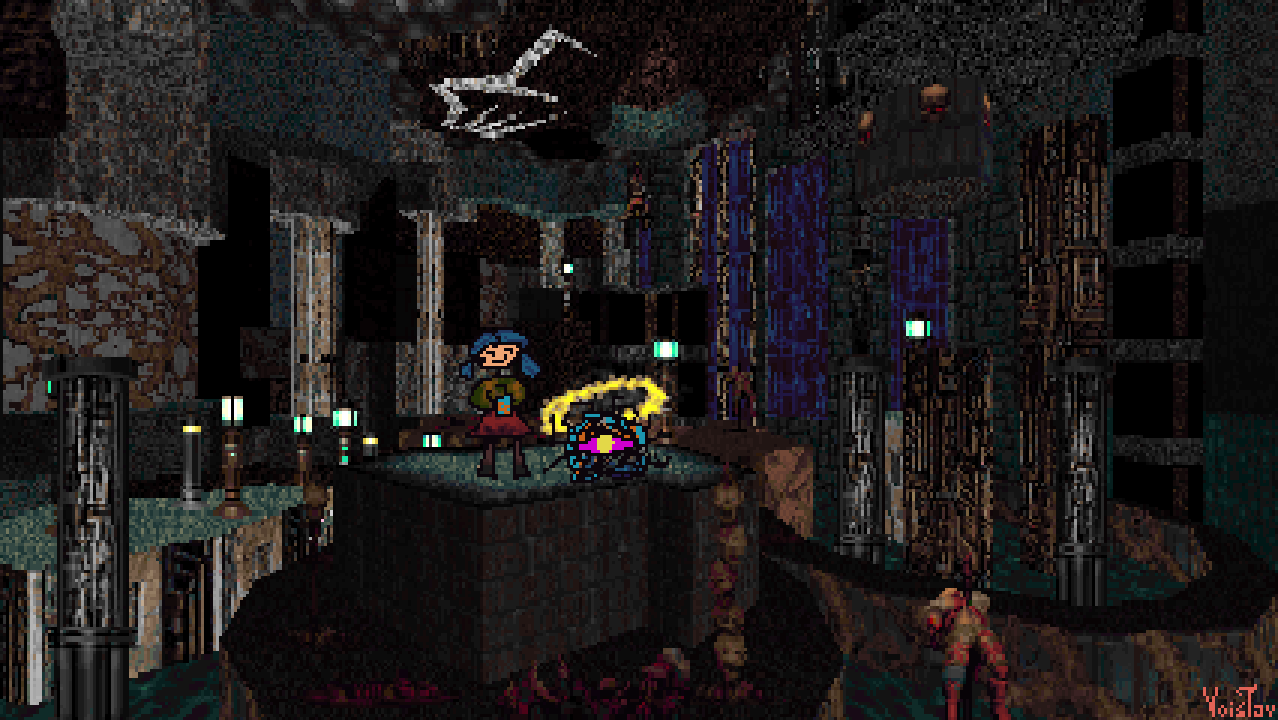
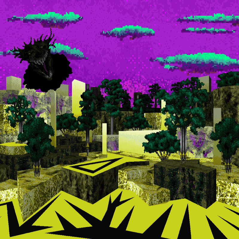
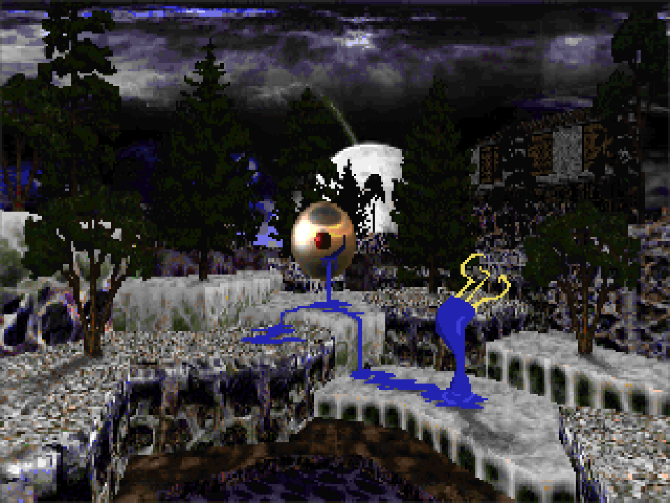
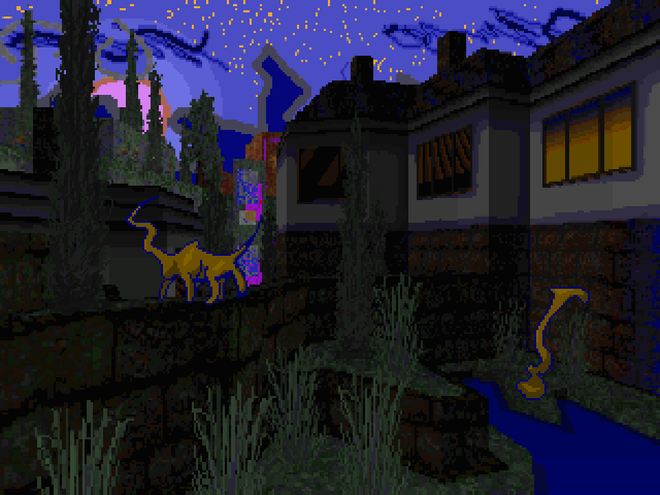
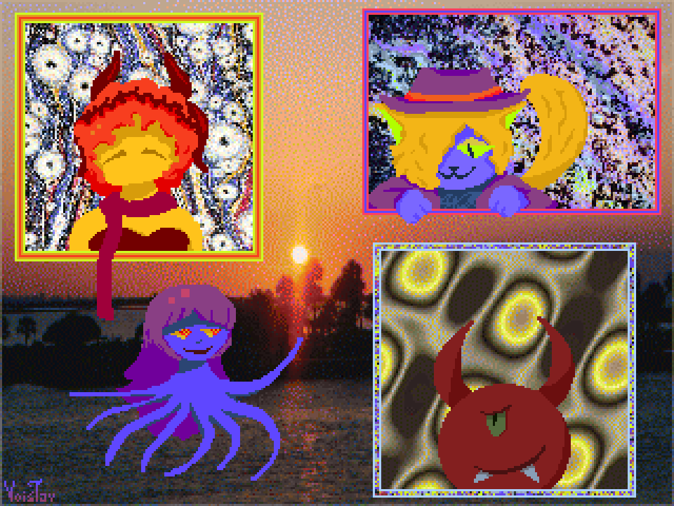
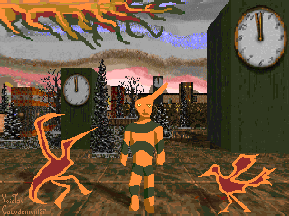
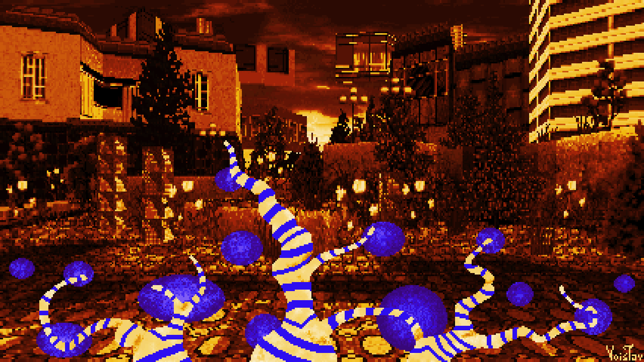
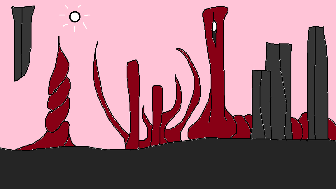
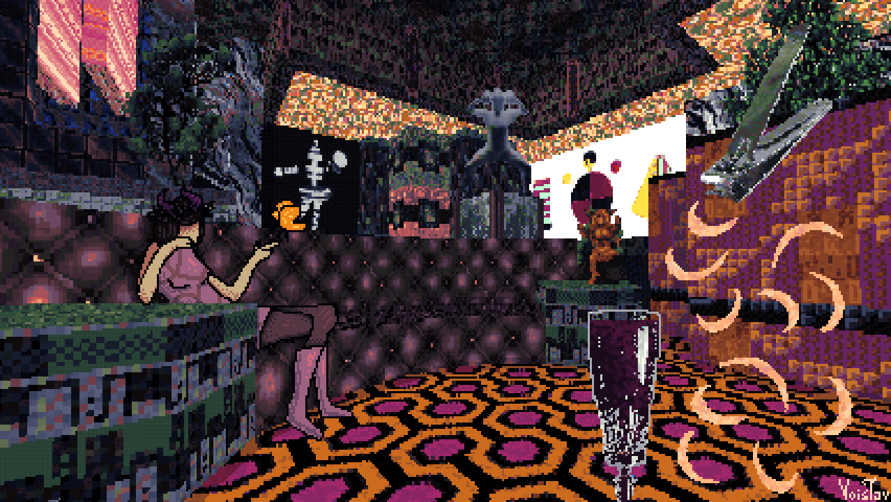
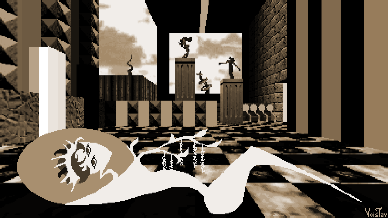
I've been enamored by a very specific vibe, or perhaps a set of vibes? No matter. I've been listening to Bossa Nova fairly often, as well as playing Collective Unconscious on Yume Nikki Online. These things evoke a very specific set of feelings, which I connect with aspects of my early childhood. I have dabbled in this vibe before, most notably in the second map of Cubes Deep. However this painting is a far more direct pursuit of it. I'd describe it as "kinda 60s-ish"

Even though it literally happened yesterday, I can't quite put my finger on what exactly inspired me to combine this vibe with the strange world created by @Ayba. Perhaps her vibes hijacked my own, who knows. All I know is that the nail clipper motif was the first thing I came up with for this and that's pretty much what kickstarted the whole thing. 

I had a pretty interesting time making this. Upped the mixed media apsect of this quite a bit, as making this involved picking making the map, taking photos of a glass and nail clipper, editing said photos, combining everything and drawing Ayba herself. I'd say the trickiest part was getting the glass set up. I took the picture of it with the nail clipper hanging off its side against the green walls of my room, but the green reflected off the clipper and made it turn invisible when I tried to remove that color. In the end I ended up removing the clipper altogether and took a seperate pic of it. 

-13. March. 2025. 

My friendship with Ayba is one of the defining aspects of 2025 for me. It was all kinds of beautiful and complicated. We aren't in much contact at this time, though she is still dear to me and I'm grateful for our friendship. 

It's quite interesting looking at paintings where I experimented with certain stuff. That kinda plastered collage style with the wineglass and nailclipper isn't something I dabbled in since, but it's certainly quite interesting! 

Sally and her juicebox homunculus 


Resources used: Doom2 stock assets with one of my palettes

Wad file: DOWNLOAD

If there's one thing I've learned from the troubled development of System Foxes is that I've let the attention I've gotten from my art and wads get to my head. My ego, ambition and desire for attention and recognition have led to all the troubles SF experienced.

Today I wanted to make something new and those same things were once again at work to make my artistic life more difficult. I tried making a new palette but it didn't work out. I tried to come up with my next masterpiece painting but that went nowhere. After all that I was forced to confront the fact that I was chasing something illusiory: the concept of a perfect work, a magnum opus or whatever, just as I did with System Foxes. Fuck it I said, let's make something that's just a painting instead. And so pretty soon this little thing came into being. Settled with using stock Doom2 textures and one of my old palettes (from my painting "Riverside"), both choices being something my pride found uncomfortable, but both paid off in the end.

Playing Speed of Doom (never played it b4 believe it or not) and Monti's Cao Bang Incident also helped me reach this conclusion, as both manage to pull of quite a lot with relatively little. No surprise SoD certainly influenced the visuals, as did one of Yume 2kki's contibutors, namely ROKU95(particularly with the way I draw characters).

All in all quite happy with this little painting, and also happy to be able to just make something fun and down to Earth again.

-27. March 2025.

Charming little piece! Gotta say, something that I'd say has perhaps served me is that I never considered my art "bad". More often than not, I was quite happy with the art I make. Helps I also find inspiration in art some might consider crude or amateurish. I certainly have a fondness for naive and outsider art.
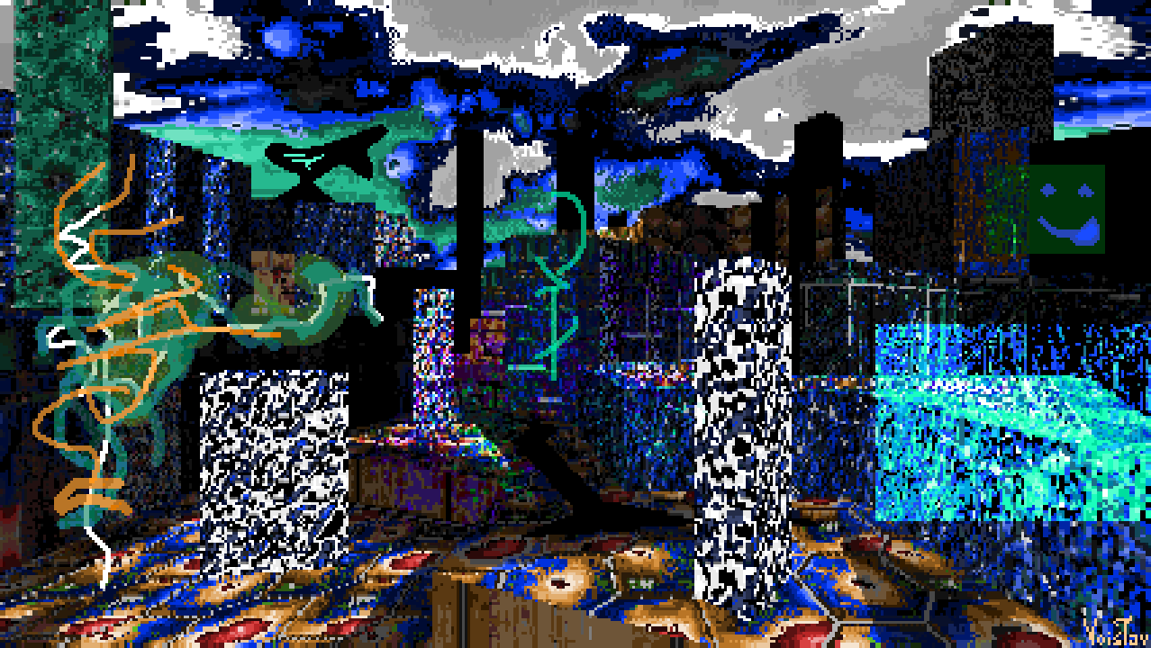
Peed of Splerb


Resources used: Plerbtex, sky by nrofl (taken from PyddTex), Rosy256 palette

Wad file: DOWNLOAD

As I mentioned under my previous painting, I've started playing Speed of Doom recently. One thing I've definitely noticed is how much its early levels are inspired by BPRD's Mucus Flow. I soon started thinking about the contrasting ways BPRD's legacy has manifested itself in people's work. While Darkwave0000 embodies the moodier aspects of BPRD's style, someone like Plerb channels BPRD's more whimsical elements. You can probably guess already how this painting came to be already. I thought that a crossover between SoD's visual theme with Plerb's various textures and sprites could make for a great combo. As I was talking about the idea with some friends, @Synami floated the idea of combining PlerbTex with Rosy256, which I ended up doing.

I ended up spending a bit more time in Libresprite adding various finishing touches. The little critter on the right, whom I'll be calling Splerb, is one of my favorite parts. Really like how I've managed to make them feel like a part of the scene. 

-28. March. 2025. 

 I love Splerb, I should draw them again someday, maybe make something with Ploerbtexx again tooo. Despite how inspired I was by it, I've yet to finish Speed of Doom :P I don't mind tho, I'd rather leave a wad be than force myself through it. Learned that the hard way when I forced myself to beat Lost Civilization's final map even though I wasn't having fun at all, just because I wanted to beat the wad. 

 Plerbdition's Mate


Resources used: an old version of Plerbdition's Gate [100 line massacre palette, textures are from PlerbTex, Perdition's Gate, Hell to Pay and Plutonia; sprites are also from PlerbTex]

Wad file: DOWNLOAD

GO PLAY THE NEW PLERBITION'S GATE DEMO MOTHERFUCKERS; It's awesome! I made this painting quite a while ago, back on the 11th of this month. I was able to do this because I've been playtesting PlG and that gave me access to its resources. Plerb and I did discuss the prospects of me making a guest map for this wad, but I settled instead of making a guest painting! I did decide to wait until the wad became public before I dropped this, and by the time the demo dropped the wad's visuals went through some changes, mainly in terms of the palette, so the look of this painting doesn't fully reflect the curent look of PlG, but I still like it. 

PS. I fucked up when saving the painting's wad file so the map is stuck in an old form, devoid of some of the details seen in the painting.

-31. March 2025.

 Plerbdition's Mate is quite a silly story :P I made it right after I released System Foxes, which explain why I settled for a painting rather than a guest map: I was burnt out! I still quite like this painting, though the fact that it was made with the resources of an indev project put me in an awkward position: I really wanted to show the painting off since I really liked it but I couldn't really do that in good conscience since Plerbdition's Gate hadn't seen any kind of release yet, and it would be weird having "unreleased Plerb wad" in the resources used section. I remember definitely feeling tempted to release it anyways, but thankfully I was able to resist. 

Another awkward thing is that Plerbdition's Gate started seeing changes soon after I made the painting, with it even getting a new palette, so my painting was already out of sync with PlG by the time the first demo came out. 

I didn't talk about inspirations I had outside of Plerb's art and wads, so I'll do so now. I remember the scene reminding me of my mom's home village when I was making it, and the Mate and the general cartoony vibe is reminiscent of the Altered Plains world in Collective Unconscious, made by orchidmantis.

Anyways, original point still stands: Go play Plerbdition's Gate! It's gonna be a wonderful wad when it's done, and the currently available maps are all cool as heck!! 
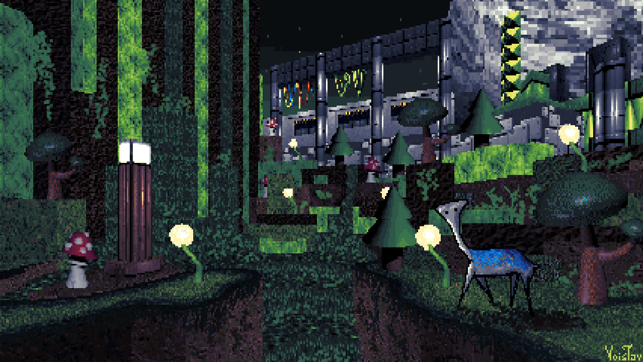
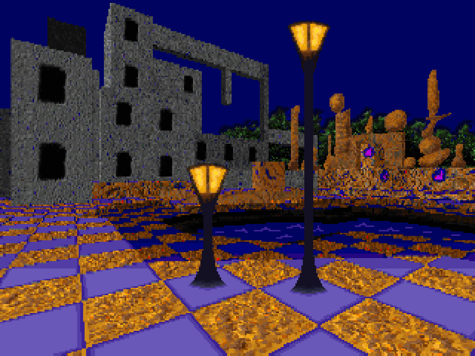
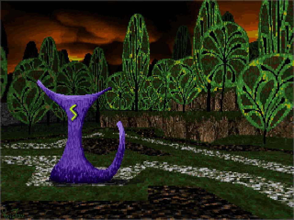
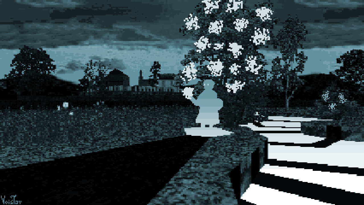
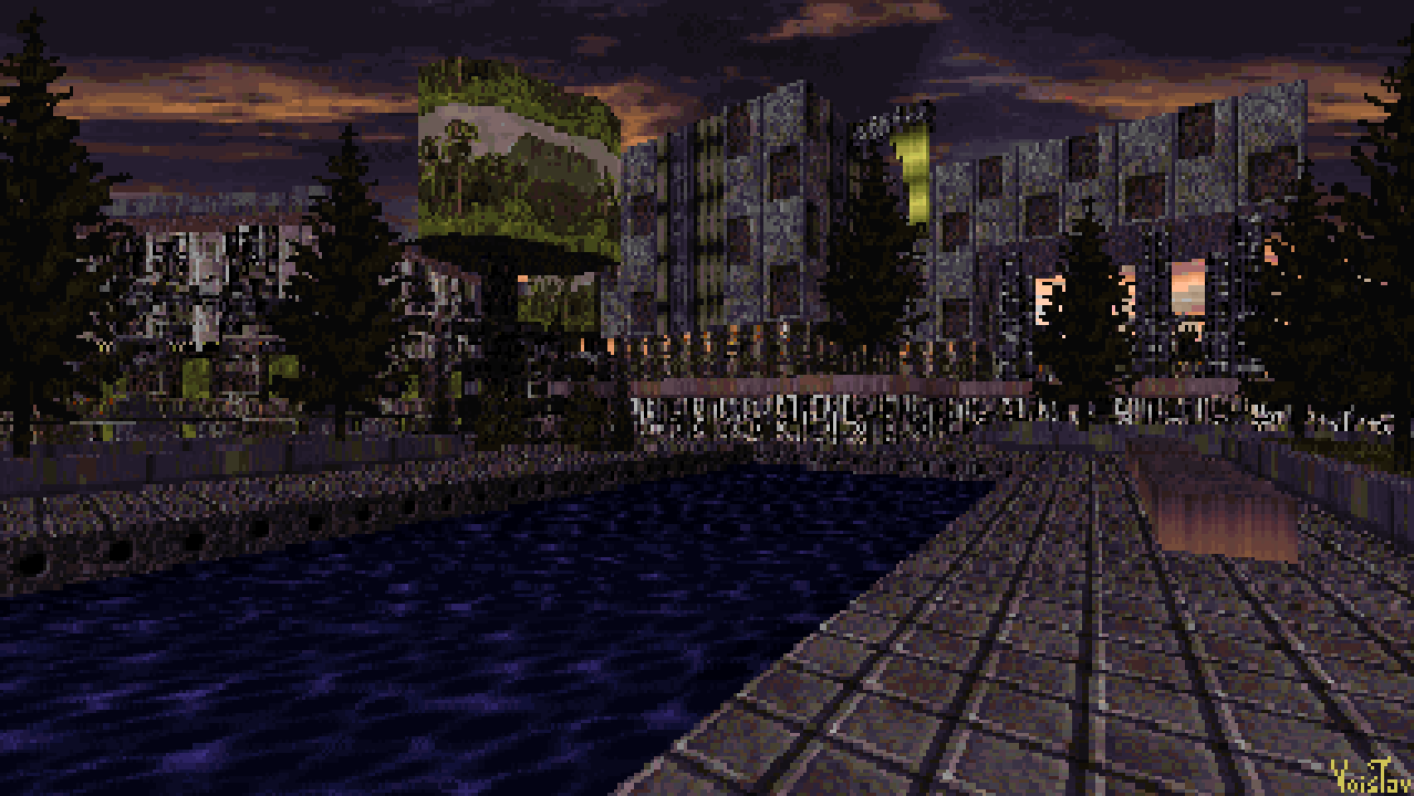
Resort


Resources used: Enceladus, Lost Civilization, The Cacofiles [MarathonTex.wad], PyddTex [textures by Brezeep, ContrastSaturation, EffinghamHuffnagel, enigma101], A.L.T., DaWerecat's resources

Wad File:

DOWNLOAD

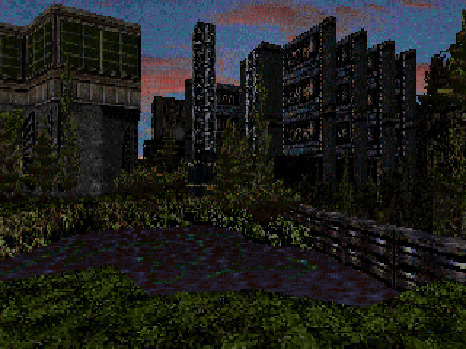
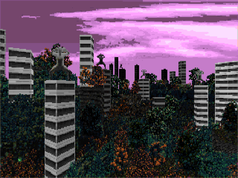
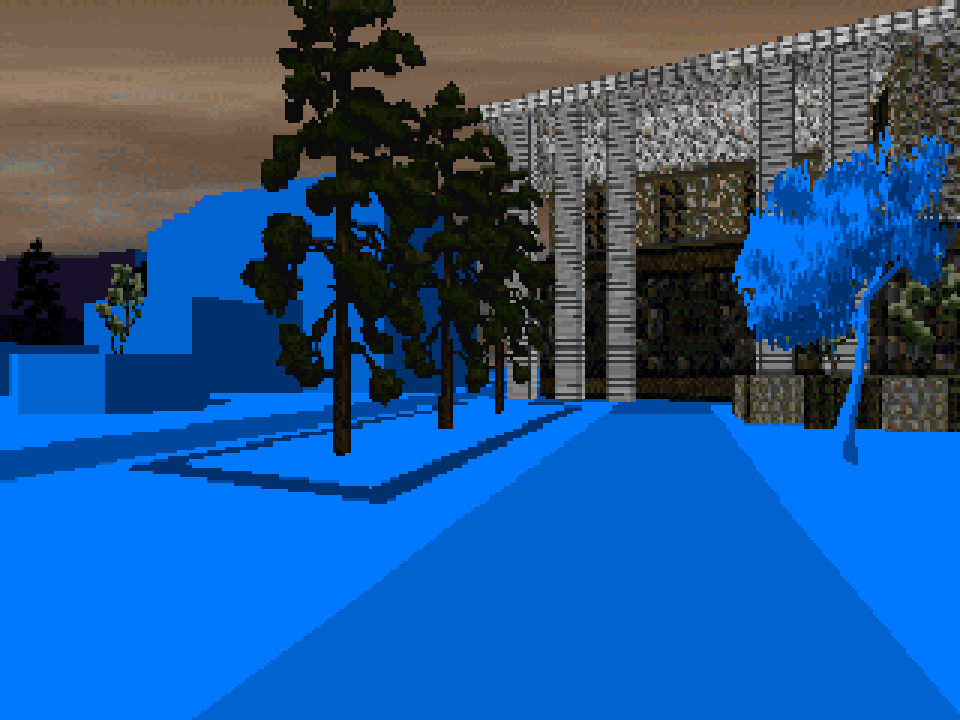
For a very long time I've had this vision of a vintage looking resort surounded by pine trees. Not sure where it came from, but it's been there. Now I got the opportunity to finally materialize it.

The idea took shape out of several ideas: using a new palette I made, using textures from Monti's wads, using the Marathon textures from Cacodemon187's latest Cacofiles release and creating a more grounded looking scene. The mishmas turned into something pretty neat! I really like how I made those sector trees in particular. I was inspired by the way Monti makes them with unusual texture choices, so I used a sky texture by ContrastSaturation for the canopy. 

-1. April 2025.

This one's lovely in it's own right, but I don't think I really conveyed the vision I talked about. I might give that specific idea another go. I saved a screenshot of this area with a pillar which I later removed:
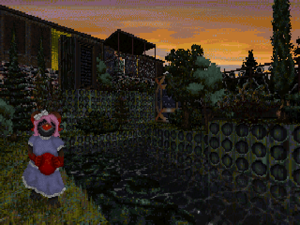
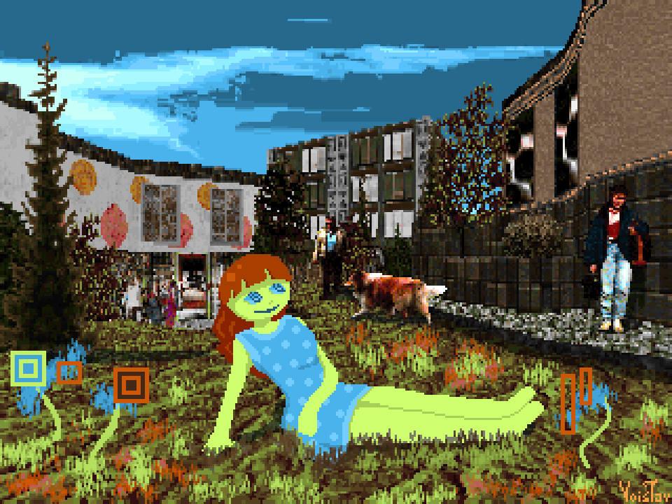
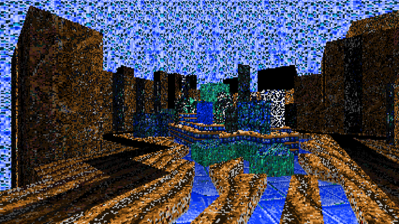
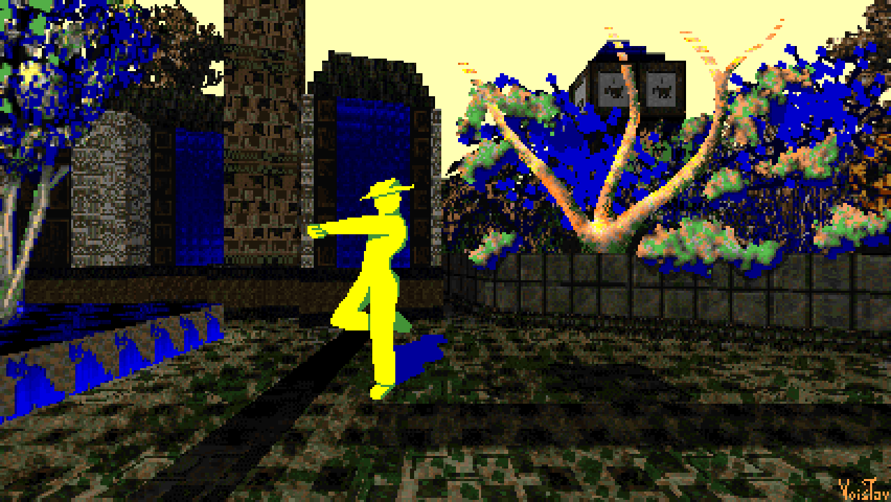
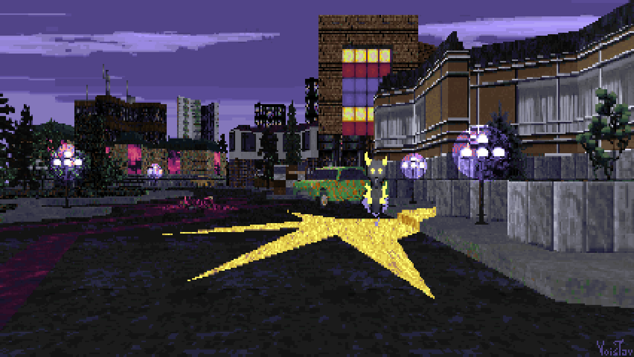


Fun at the Fair

featuring MittenBits 


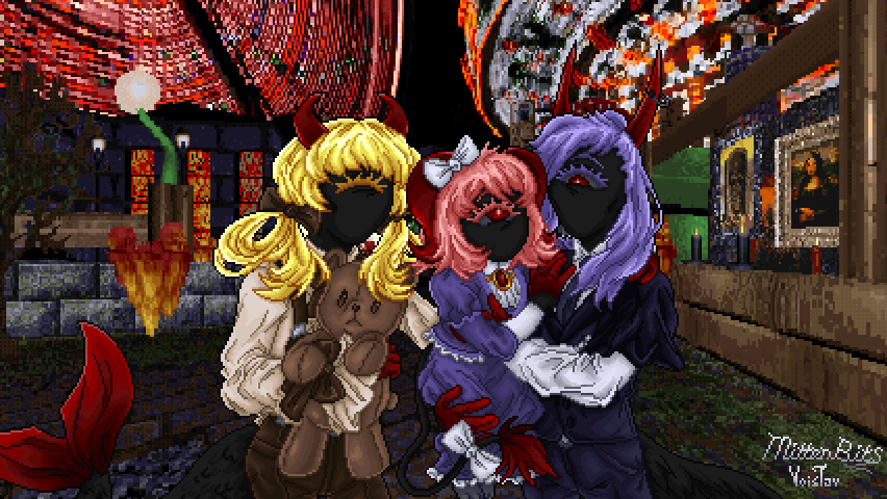
Resources used: DreamPal, Grove, PlerbTex, Archi's texture pack, COMTEX, Graphtallica #3, Sheer Poison textures, Pexels [photo by Kendall Hoopes, photo by Ahmet Kurt]

Wad File:

DOWNLOAD

This is a colaborative piece I made with my lovely partner MittenBits! We were talking about doing a collab and soon enough they came up with the main idea:

A scene of their characters enjoying their time at a carnival, in front of a ferris wheel. I did the background, which took a bit of figuring out on my part as I had never really explored a carnival aesthetic, not thought about having a ferris wheel in Doom. Eventually I added the ferris in the form of a sky texture I made from combining two photos I found on Pexels, and for the rest of the scene I just threw a variety of textures at the wall until I had something that fit the bill. MittenBits took over after I was done with the background and drew the characters.

From left to right, the characters are Greta, Loria and Damian. Damian is Loria's father, while Greta is Damian's sister. Loria's mother left her and her father when she was very young, and Greta has been helping Damian take care of her since. Damian works as a bartender, while Greta is a perfumer and owns a perfume and soap shop. 

-4. April 2025.

As evidenced by my newest painting, MittenBits and I are still in a happy relationship! I love him to bits and I couldn't imagine life without him. I also love all of his OCs, and I definitely wanna draw them more someday.

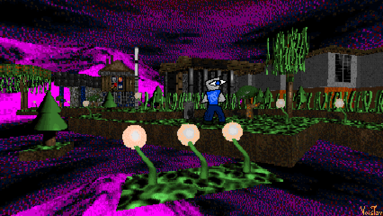
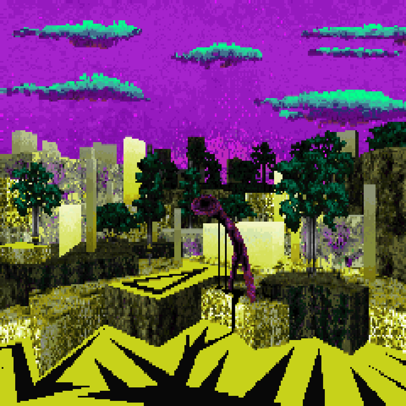
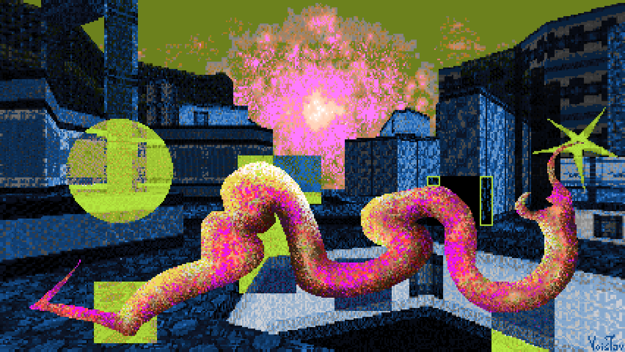
 Xutjmurasti Zavitxaj


Resources used: Firerainbow 2, Lost Civilization, Rosy256

Wad file [needs to be run with Firerainbow 2]:

DOWNLOAD

Been wanting to make a new painting but wasn't finding the inspiration for anything I found interesting. The push I needed came from finding the paintings of Wenzel Hablik. What I ended up with was this vibrant landscape made out of Firerainbow's FIREBLU recolors and dotted with some cool trees I found in Lost Civilization. One of my favorites must admit, which is pretty cool because I cobbled this together in less than an hour and a half. I hope you enjoy the vibes here as much as I do!  

 -11. April 2025.

 I had this as my desktop background for quite a while! Very funky still, Firerainbow 2 and Rosy256 combo is peak still. Anyways, to explain the bizarrely written title: at the time I was thinking of ways to adapt the orthography of my language, Serbian, so it can be written in Doom. So basically, having it only use letters found in the English alphabet. Obviously rather clunky and looks weird. In the actual Latin alphabet used for my language, the title would be Šućmurasti Zavičaj, which I could roughly translate as "weirdly colored homeland". BTW, the tree sprites I found in Lost Civilization I used for this are originally from Killing Time.

AFX Liquor


Comission for Jared Ray Hawking - a cover for his upcoming album titled AFX Liquor

Resources used: Used my own stuff for everything :3
I did make a version of my sky texture that was converted to Rosy256 but that was a miscelaneous experiment and isn't part of the final piece.

Wad File + Textures, sprites, in-progress snapshots of the piece, aforementioned Rosy256 sky.

DOWNLOAD

Jared saw my stuff in a Discord server I wasn't even active in anymore and reached out to me. I never did a comission before so this was quite an interesting turn of events for me. It seemed like an interesting opportunity and I accepted.

Working on this really pushed me into new territories, as this is the first Doom painting of mine which uses all-original resources. Not a trace of Doom's assets can be seen here. I made the textures mostly using photo-manipulation, a method inspired by Ayba's works. Sprites were hand drawn. All of that was made using a palette I made from the ground up, so if anyone wishes to use these they'll need to convert them to their palette of choice (Rosy256 might be well suited in this case)
The cover went through a number of changes as I made it in order to better fit Jared's vision. I've included all snaphots of the development in the attached, but I'll also post some that I found interesting bellow as well:


-25. April 2025.

 The three images bellow are Imgur links, which is undeniably troublesome for my British audience, however, fret not! These as well as every snapshot of the cover's development are included in the above download link alongside the main wad file!

 The first and only commission I've done so far. It certainly did push me into new territories! It was the first time I made hand-drawn tree sprites, which is something I've grown to love doing! All around a cool experience! Though if I end up doing commissions again, I'd certainly put down some proper guidelines. I'd definitely be more adamant about the style and technical limitations I work under. I've certainly been thinking of doing more commissions, but there's a bunch of questions I'd need to clear up. Stuff like pricing, or if I could get away with making use of Doom's textures and sprites for making commission paintings or if I'd have to make everything from the ground up and use royalty free stuff. Also been considering setting up a Patreon or Kofi or something. Will see. If anyone might be interested in commissioning me for something feel free to write me an Email or contact me on Doomworld or Bluesky.

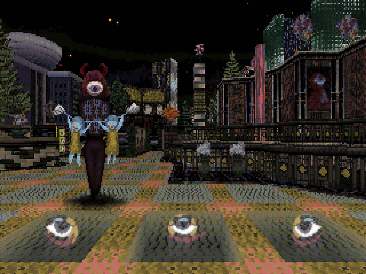
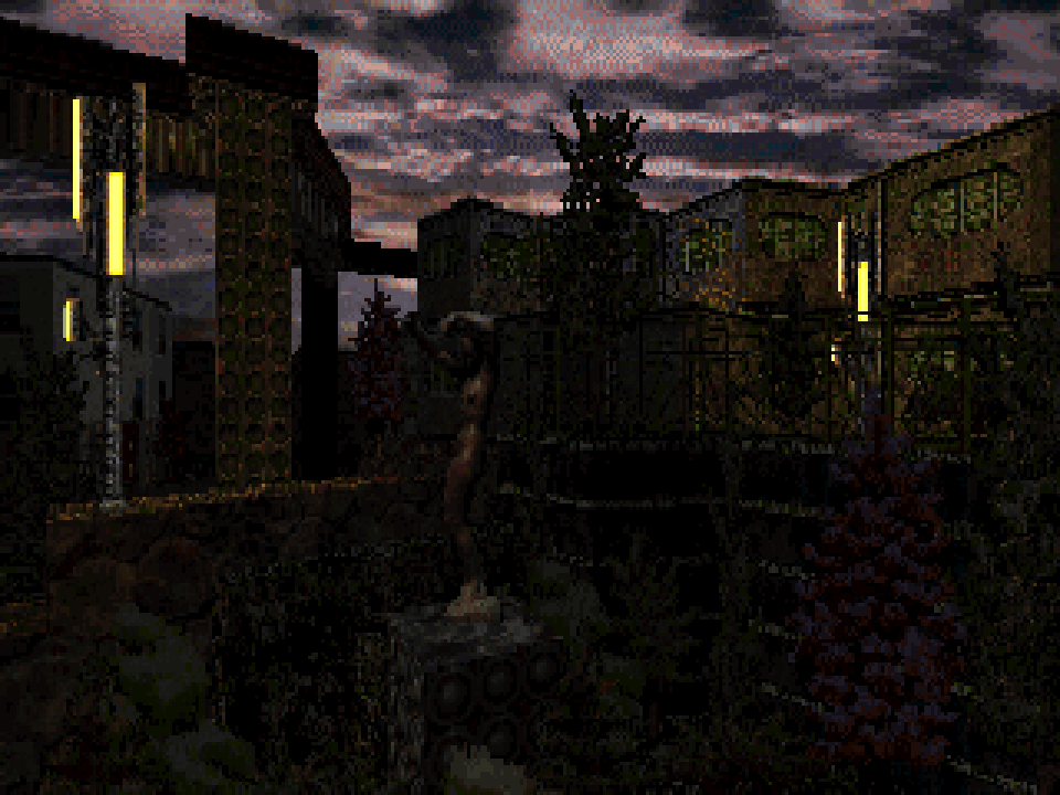
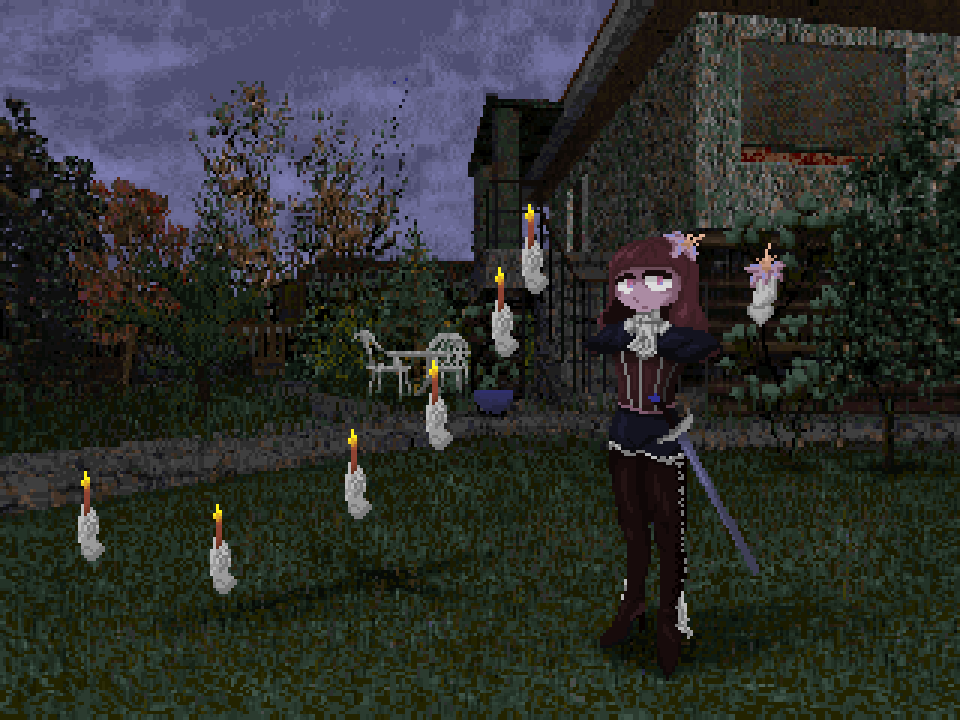
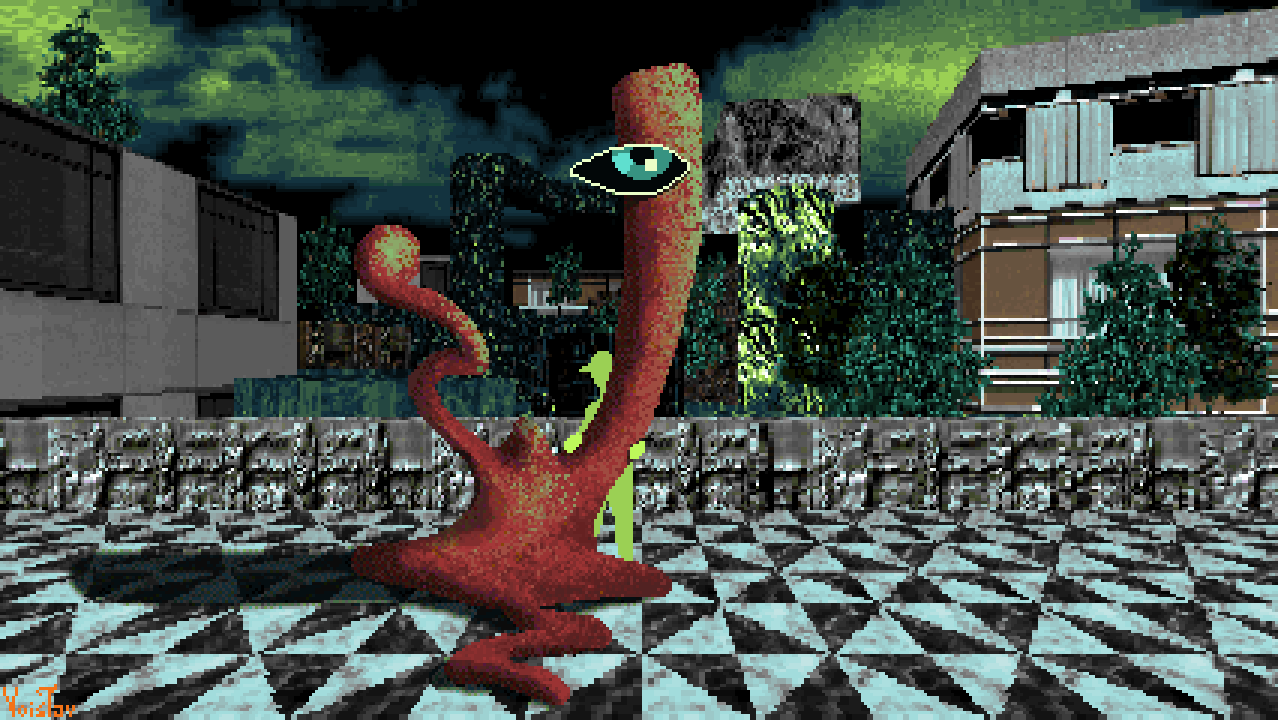
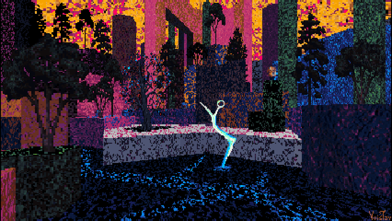
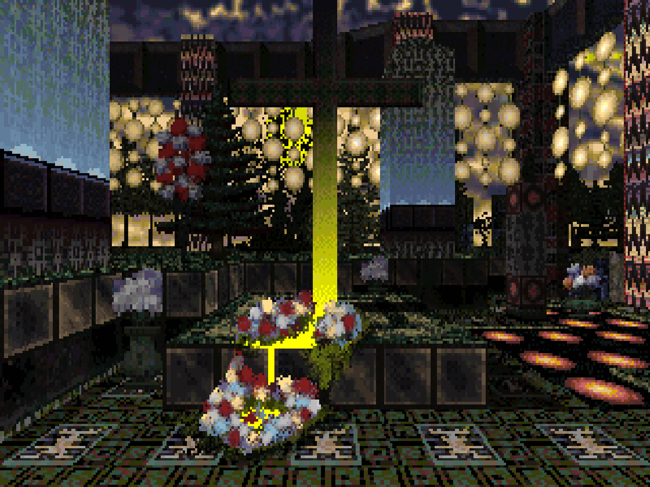
Göttin der Pfefferkörner 


Resources used: Sepia by Petyan, Plerbtex by Plerb, Blackfairy by Ayba, Mechadon's Box o' Skies

Wad File: DOWNLOAD 

I've been playing through Sepia these past few days and it's allready one of my favorite wads! Absolutely delighted by its aesthetics and atmopshere. Felt like making a painting using its palette and eventually I settled on one that's also inspired by Ayba's Blackfairy, and also features Ayba herself in an abstract form. Favorite part for me was using sprites of her custom enemies as statues.  

-1. May 2025.

 Title means Godess of the Peppercorns in German. German is a language I learned to speak as a child thanks to the fact that all the cartoons I watched as a kid were on German TV channels, primarily German Nickelodeon and Super RTL. It also helps that my mom spent several years in Switzerland, and I have quite a few family members living in that country too. I rarely watched cartoons in Serbian, and my only exposure to cartoons in English was watching Cartoon Network whenever I was at my aunt's place. 

Sadly, my knowledge of German eventually began to stagnate and decline during my teenage years as all the media I enjoyed during that time was in English. Only recently did I decided to try and re-learn German, and while it's been a rather slow process, it has born fruit! Can't speak it well yet, mainly because I don't have much opportunity to do so, but my understanding has definitely improved!

Anyways, back to the painting at hand! Sepia is a wonderful wad, and I'm happy with how this came out! I had it as my Firefox background for quite a while. Still do, but I don't use Firefox anymore, switched to Waterfox. It went through numerous revisions, mainly because I was figuring out how to draw Ayba in this rather unusual style, and I've got several snapshots of the process saved which I'll share in a zip file: 

DOWNLOAD 

Шућмуриш 


Resources used: Palette I made

Wad File: DOWNLOAD

 I got a hold of some of Sandy Petersen's Weed which made me create a whack ass palette for the hit 1994 video jame Doome Zwei. At first I was gonna use the palette for a noble cause like making Back to Weedturn 420 but unfortunately the evil and vengeful sprirt of Adrian Carmack, borther of John Carmack, made me realize that the stock textures looked kinda fire in their raw form with the palette applied. ANd so I made this swank ass painting!!! 1337 

-13. May 2025.

 Title is Serbian written in Cyrillic, in Latin it's Šućmuriš, which I'd translate as "weird mess of colors".  An advantage of starting this blog is that I can talk about this piece while unshackled from the grip of the shitpost demons that were haunting me at the time I wrote the original description. The palette I made is certainly quite unusual by Doom palette standards, and I do wonder what it could do if I were to try and make a more developed thing with it, with textures and sprites converted to it and perhaps even made for it. Perhaps one day, though I doubt soon, can't say I feel particularly inclined to work with it. To be frank I find it a bit monotonous - a bunch of straight color ramps of evenly spaced out hues, copied three times and given three different saturation levels. I dunno about you, but I like myself a palette with a bit more personality. 

Anyways, at least I got to explore the aesthetic of textures with a foreign palette applied over them without their prior conversion to that palette. As I've began using palettes fully distinct from Doom's quite often, it's an aesthetic I encounter a lot these days. 


That will be all for this batch! Making these dumps can feel rather tedious, and considering this is the biggest one yet, I feel quite tired! Still, I'm happy to make them, they're a nice opportunity to reminisce, and also provide an opportunity to replace the original Imgur links for the paintings with Postimages ones for the sake of my British audience on their original Doomworld topic. 

Take care and have a lovely day! 

[ART] Прољеће на Коштурници

Прољеће на Коштурници (Spring on Calvary)  Resources used: Same as for Anchoress Alley, with some additional textures made by myself...